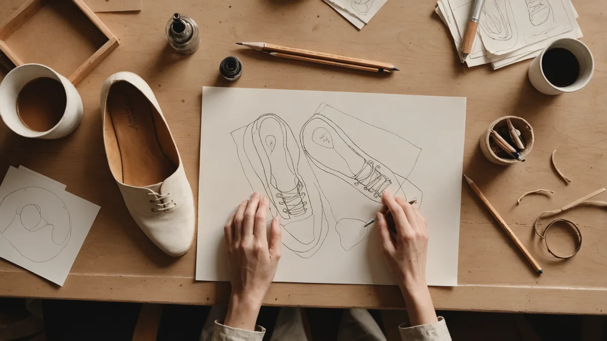
The wide toe box is the single most contentious design element in minimalist footwear, not because the biomechanics are unclear — they are quite clear — but because almost every wide toe box shoe currently available makes a visual statement that many people find difficult to accept. The statement is roughly: I have prioritized function and I am willing to look like I did.
At NEULO, when we began working on the Arc Runner in 2023, we were committed to the wide toe box on biomechanical grounds and equally committed to producing a shoe that did not communicate compromise. That second commitment proved significantly harder than the first.
What the biomechanics actually require
The case for a wide toe box rests on toe splay — the natural spreading of the metatarsals during weight-bearing. In a relaxed, unshod foot, the forefoot width at maximum toe splay is typically 20–30% wider than the same foot in a conventional shoe last. That compression is not neutral: compressed toes cannot contribute to the propulsive push-off that is part of efficient gait, the intrinsic foot muscles cannot activate effectively when the toes are held in approximation, and over years of use, the compressed configuration begins to be the resting configuration — which is the mechanism behind many common forefoot pathologies.
A shoe that allows natural toe splay needs a forefoot width roughly equal to the foot's unloaded anatomical width plus enough clearance that the toes can move during dynamic loading. For a reference foot of common dimensions, this means the toe box needs to be somewhere between 15 and 25 millimeters wider at the widest point than a conventional shoe last of the same nominal length. That is a significant dimensional difference. It is the source of the aesthetic problem.
Why most solutions read as medical
When designers encounter the wide toe box requirement, the most common solution is to extend the existing last shape laterally — essentially stretching the conventional toe last outward. The result is recognizable: a shoe that looks like a standard trainer with an abnormally wide front end, as if the forefoot has been inflated. This silhouette reads as an accommodation rather than a design. It signals that something anatomical needed to be corrected, which is precisely the message that makes people reluctant to wear the shoe outside of pure fitness contexts.
A second common approach is to go fully abstract — to abandon any relationship with conventional shoe proportions and design something that looks like a foot rather than a shoe. Several minimalist shoe makers have taken this direction. The results are often genuinely interesting as objects but can feel alienating to people whose relationship with footwear aesthetics includes conventional runner proportions. They also tend to be extremely narrow in their appeal: people who love them love them completely; people who don't, don't.
We were not trying to make an art object. We were trying to make a shoe that a runner who cares about biomechanics and also cares about how their shoes look would choose over a conventional shoe — not as a concession, but as a preference.
The last as designed form, not adjusted form
The insight that finally opened the design problem for us came from Takeda-san, the craftsman who worked on the Arc Runner last geometry. He observed that we were approaching the problem the wrong way: we were starting from a conventional runner last and asking how much we could widen the forefoot before it looked wrong. We should instead start from the foot's actual geometry and ask what a shoe shaped around it should look like.
This sounds obvious but required a genuine conceptual shift. A foot is widest at the metatarsophalangeal joints — the ball of the foot — not at the toes. The toe line of an uncompressed foot is not a squared-off rectangle; it follows a gentle curve determined by the relative lengths of the five metatarsals, with the first and fifth metatarsals being shorter than the second through fourth. The natural foot shape, viewed from below, has a very specific proportional geometry that is different from any conventional shoe last.
When we designed the Arc Runner last from this starting point — widest at the ball, with the toe region following the actual curve of natural toe length distribution — the result looked different from wide-toe-box shoes designed by stretching conventional lasts. It still looked wide in comparison to a conventional trainer. But it looked wide in the way that a foot looks wide: proportionally coherent, with its widest point positioned correctly and its toe region following a line that the eye reads as intentional rather than swollen.
Proportion, proportion, proportion
The visual resolution of the wide toe box comes almost entirely from proportion management in areas other than the forefoot. A wide forefoot on a shoe with a narrow midfoot looks wrong — the visual discontinuity between the two sections draws attention to the width difference and reads as a mistake. A wide forefoot on a shoe with a correspondingly wider midfoot and a gradual taper from midfoot to heel reads as a design.
We adjusted the midfoot width of the Arc Runner last upward from the standard runner proportion. Not dramatically — the shoe is not a wide shoe in the conventional sizing sense — but enough that the transition from toe box to midfoot is gradual rather than abrupt. The difference in visible width between the forefoot and the midfoot section is now approximately the same as the difference in visible width between the midfoot and the heel, which means the eye reads the shoe as having consistent proportional logic rather than a distortion in one region.
Profile height also matters. A tall upper profile at the toe makes the wide forefoot read as bulky. A lower-cut upper that stays close to the foot at the toe lets the width read as a plan silhouette decision rather than a volume decision. The Arc Runner upper is deliberately low at the toe — the top of the toe box is perhaps 5–7mm lower than a conventional runner would have at the same location — partly for proprioceptive reasons and partly because the visual result is cleaner.
What we are not claiming
I want to be direct about what this design approach does and does not accomplish. The Arc Runner does not look like a conventional narrow-toed running shoe. It cannot look like one, because the toe geometry is fundamentally different. If you stand the Arc Runner next to a standard trainer, the forefoot is visibly wider. Some people will see that and find it immediately appealing. Others will need to recalibrate their aesthetic reference point.
What we are claiming is that the shoe looks like what it is: a shoe designed around the geometry of an uncompressed foot, with proportions that are internally consistent and visually deliberate. The width is not apologized for, not disguised, and not the result of stretching a conventional last. It is the shape the shoe needed to be, designed to look like it meant to be that shape.
There is a version of this problem that has no solution: the person who simply prefers the aesthetics of a narrow toe regardless of the biomechanical argument. We are not going to satisfy that preference. We think the biomechanics are worth the aesthetic adjustment, and we have tried to make that adjustment as small as it can be while leaving the function intact. The rest is personal preference, and personal preference is a legitimate thing to have.
What I do know is that the people who have seen the shoe and not immediately reached for a comparison with medical footwear are the ones who have looked at it on its own terms, without mapping it against the conventional runner silhouette. That is the seeing we designed for. It requires a moment of adjustment. We think the moment is worth it.